Client: Cryoport
Category: Branding
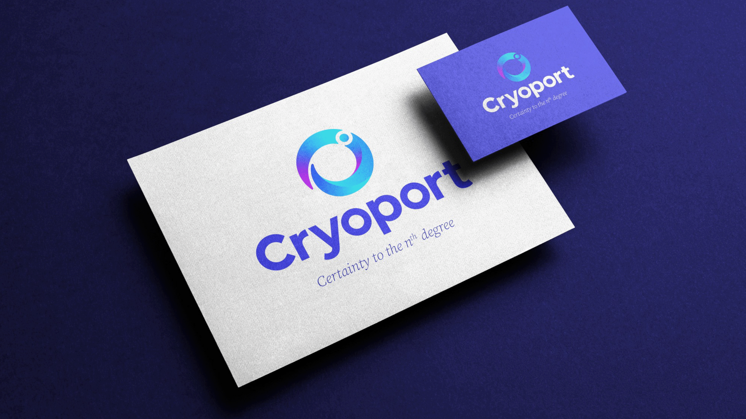
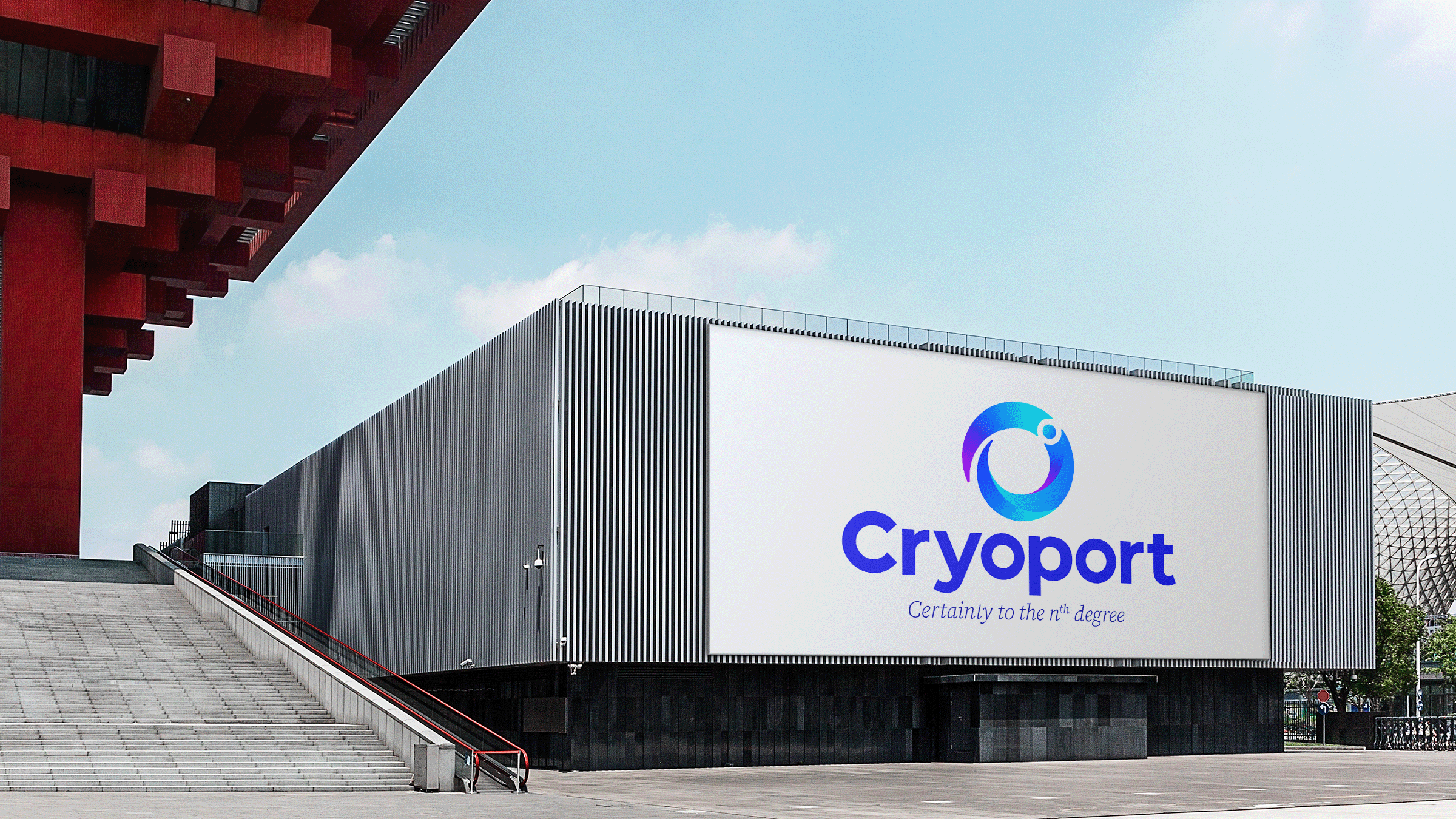
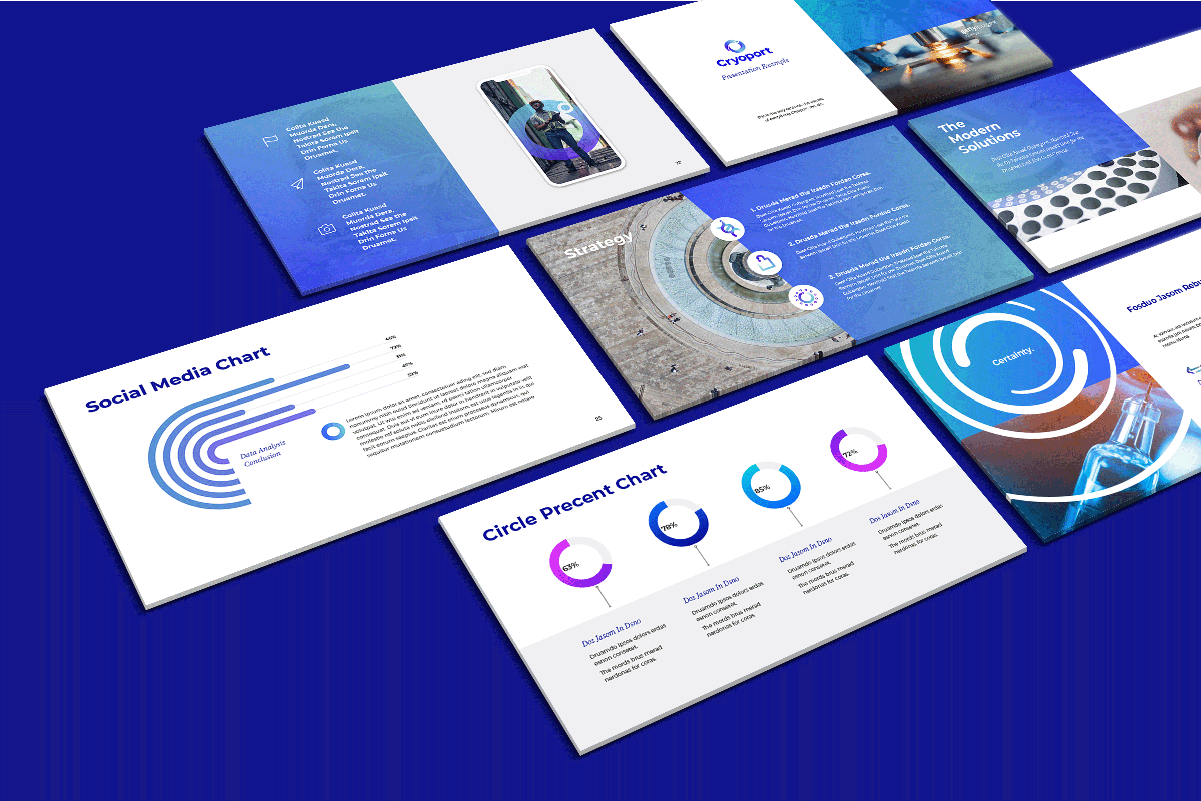
Objective: Global rebrand.
Insight: Our client wanted to evolve their existing identity, which featured a stylised degree symbol, in a way that protected any existing brand equity, but also made their branding work as a holistic design system that was futureproof enough to accommodate any future, yet unseen, developments in the scale and scope of their business.
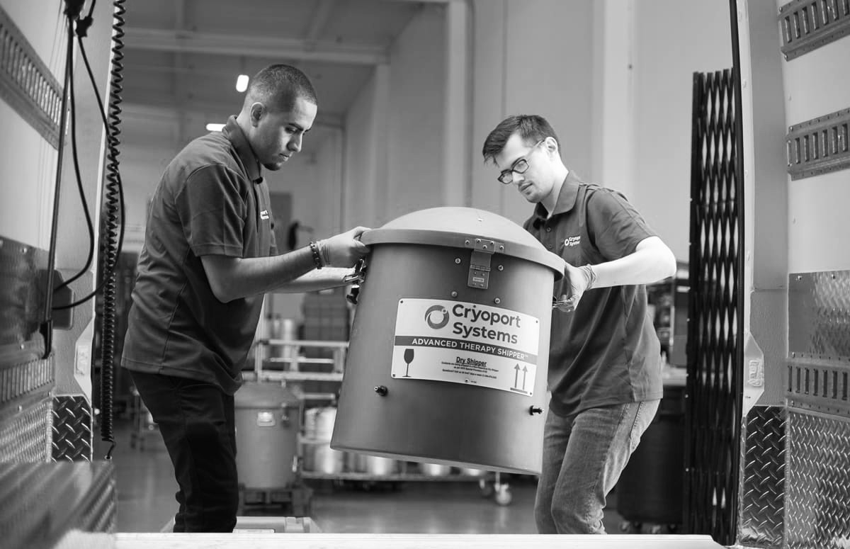
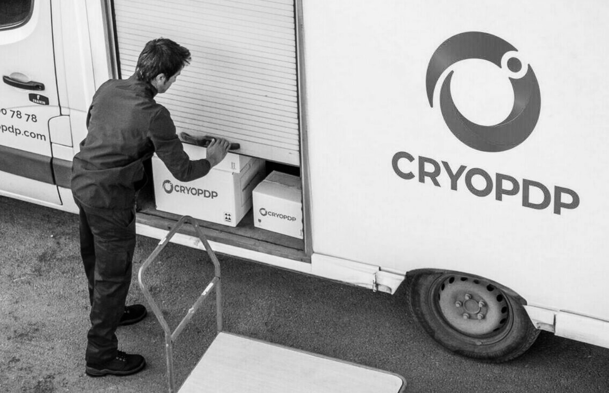
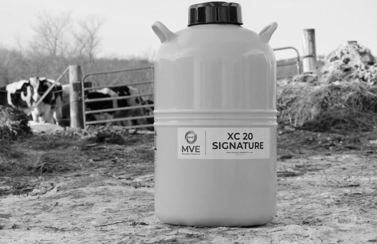
Idea: Cryoport came to us at a time when they had recently acquired a number of small businesses to expand their in-house capacity to offer their customers services along each link of the cold chain logistics journey. They needed to completely revamp their brand strategy, brand architecture and visual identity to keep pace with their commercial strategy, as a result. What resulted was a contemporary visual identity that still felt very ‘Cryoport’, built on strong brand strategy foundations and equally strong design fundamentals to ensure it was fit for purpose for years come.